Programme
Speakers
These eight speakers will tell you all about the mobile web and more.
| 08:15 | Doors open, coffee & registration | |
|---|---|---|
| 09:00 | Stephanie Rieger | The Emerging Global Web |
| 09:50 | Peter-Paul Koch | The plural of Chromium is Chromia |
| 10:40 | Break | |
| 11:10 | Sascha Wolter | Connect YOUR world of things: Why, What, and How? |
| 12:00 | Jacob Rossi | The Input Shouldn't Matter - Building for Adaptive Input Experiences |
| 12:50 | Lunch | |
| 13:50 | Seb Lee-Delisle | IRL - bring computing into the real world |
| 14:40 | Agnieszka Walorska | From responsive to anticipatory |
| 15:30 | Break | |
| 16:00 | Tim Kadlec | Better by Proxy |
| 16:50 | Petro Salema | Mobile East Africa |
| 17:40 | Drinks & discussions | |
From responsive to anticipatory
In the era of connected devices we are dealing with an ever increasing amount of different data. In most cases "Dumb Data". Most interfaces we use today just react to actions taken in the present, without utilizing the data available to predict future needs, creating anticipatory experiences.
Some companies, like Google (Nest, Google Now) or Amazon (anticipatory shipping, Echo) have recognized the value of anticipation early on, others are following suit.
Pro-active applications can certainly contribute to a better user experience, but they also may cause the user to feel uncomfortable. Hence, answering the following questions is of paramount importance: How to create relevance, without being uncanny? How to support the user without patronizing him and how to avoid frustration resulting from false or inaccurate anticipation.
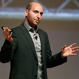
Agnieszka Walorska

Agnieszka M. Walorska is a founder of a digital consultancy Creative Construction Heroes GmbH, focusing on User Experience and Digital Innovation. Agnieszka is a speaker and author of several publications on usability and readability and has lead successful UX and innovation projects for banks and energy, insurance and media companies.
The Input Shouldn't Matter - Building for Adaptive Input Experiences
The web's best feature is its reach across most computing devices. There's an overwhelming amount of good resources out there to help guide you through responsive or adaptive design to adjust for varying screen sizes and network conditions. But what about input? In this presentation, learn important tips and tricks for adapting to input types across devices from mouse & keyboard to touch to motion controllers like Leap or Kinect and more. We'll explore the Pointer Events standard as well as what to do when only Touch or Mouse Events are available. We'll also look at key differences in the behavior of different input types, including important concepts like the virtual viewport, hover, input precision, and latency. Finally, we'll spend some time discussing what's on the horizon for input in browsers and how web developers can help shape the future.
Jacob Rossi

Jacob Rossi is an engineer on the Internet Explorer team working on advancing the web through standards and new user experiences. He's the author and co-editor of the Pointer Events and CSS Snap Points web standards, former editor of DOM Level 3 Events and UI Events, and contributor to numerous other HTML, CSS, and JavaScript related standards. His recent work focuses on building an industry-leading touch experience for the browser and launching http://status.modern.ie. When not thinking about what's next for the web, you'll find him out on Lake Washington or hanging out in a pub in Seattle.
Mobile East Africa
Technologies are of little consequence until they are surfaced through an acceptable interface. And since consumer products operate in the context of the society in which their users live, a good virtual or physical interface must be one that aligns with the accepted norms and practices of the users' societal fabric.
This talk will explore the phenomena of mobile technology in East Africa to see what it teaches us about the nature of technology adoption and how to build consumer products that interface with society as a technology platform.
What the mobile phone has done in countries like Tanzania and Kenya is permanent disruption. The reach and impact of mobile technology in these places is not hype. For millions of farmers, taxi drivers, and teachers, mobile money is a reality of everyday life in East Africa.
These developments have been well documented, but it may surprise us to consider that the mobile money revolution in East Africa was not built on smartphones. It was built on dump/feature phones that existed before the first iPhone came into market, and there are useful lessons to be learned in this.
Petro Salema
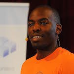
Petro Salema leads the development of the Aloha Editor, to make the web a powerful platform for rich-text content creation. He discovered the wonderful possibilities for software to impact the human condition with the World Wide Web in his early teens. He noticed that most limitations with what we can build with software are only as insurmountable as the limits to our imagination. And thus began his study of code and design—the craft, and people behind it.
Connect YOUR world of things: Why, What, and How?
Industry 4.0, Machine-to-Machine (M2M), Internet of Things (IoT) or whatever you like to call it (indeed, there are differences)… It’s not just about generating business value, it’s not about the latest technology in the first place! It’s much more about creativity and finding (or creating) new needs! It’s about innovating with value. Therefore, Sascha introduces you to an end-to-end-process from ideation to practical creation feasible for almost everybody. He shows you a playful way of creating your very own connected (and hopefully smart) world that matters!
Sascha Wolter

Sascha Wolter is a professional developer and user experience enthusiast with passion for M2M, Internet of Things (IoT), Rich Applications and Mobile Apps in all flavors. He also works as a consultant, trainer, software-architect and author and contributes articles to a number of magazines. His books and video-trainings are bestselling publications in Germany. He has been giving lectures at conferences like “jQuery Europe”, ”Adobe MAX”, “Flash on the Beach” and “Microsoft xtopia” for several few years now. Sascha is also the founder of the leading German Adobe User Group flashforum.de with more than 100,000 members and cofounder of the internationally renowned conference beyond tellerrand. Furthermore, he is board member of the Usability & User Experience committee at BITKOM. If he is not tinkering with new soft- and hardware in the Internet of Things for Deutsche Telekom AG – Connected Home, he likes playing Lego with his kids in his spare time.
IRL - bring computing into the real world
We all love our computers, but generally they are mostly something we keep indoors. In this fun and interactive session, digital artist Seb Lee-Delisle will show you that really amazing things can happen when you take them into the elements.
Seb Lee-Delisle

Seb Lee-Delisle is a digital artist and speaker who uses computers to engage with people and inspire them.
As an artist, he likes to make interesting things from code that encourage interaction and playfulness from the public. Notable projects include Lunar Trails, featuring a 3m wide drawing machine, and PixelPyros, the Arts Council funded digital fireworks display that toured nationwide in 2013.
As a speaker he demystifies programming and explores its artistic possibilities. His presentations and workshops enable artists to overcome their fear of code and encourage programmers of all backgrounds to be more creative and imaginative.
The plural of Chromium is Chromia
Where web developers expect Chrome to offer a single platform for web sites and web apps, and that all Android 4.3+ users use Chrome as their default browser, reality is diverging at a fast clip. Google Chrome has never been the default browser on any system, except for Google's own Nexus and the Motorolas that were created while Google owned the company. Most important Android vendors, such as Samsung, HTC, and LG, are now using their own Chromium-based browsers as defaults. So far PPK identified eleven of them, and they're all subtly different.
What's going on? Why does everyone want its own Chromium? Why doesn't Google step in and force Google Chrome on everybody? And what's the deal with that other Android default browser, Android WebKit?
In this presentation PPK explains.
Peter-Paul Koch

Peter-Paul Koch is a mobile platform strategist, browser researcher, consultant, and trainer in Amsterdam, the Netherlands. He specialises in the mobile web, and especially mobile browser research. On the Web he’s universally known as ppk.
He won international renown with his browser compatibility research, founded Fronteers, the Dutch association of front-end professionals, and advises mobile and desktop browser vendors on their implementation of Web standards.
Meanwhile he concentrates on the mobile web, and then especially on the aspects he feels web developers are ignoring, such as the UC browser and Xiaomi and Micromax devices. His personal collection consists of about 50 mobile phones, and he uses about half of them in his daily testing. Occasionally one of them emits a soft, melancholy beep, but he has no idea which one and studiously ignores it.
The Emerging Global Web
The web was first conceived 25 years ago, by an Englishman. Fifteen years later, as the first crop of dot.coms were going bust, close to 60% of its users (and all Alexa "top 20" sites) came from developed nations. Fast forward to today, and the picture is strikingly different.
Almost half the Alexa "top 20" now comes from emerging economies. Economies where close to 3 billion people have yet to use the web, but thanks to mobile — won't have to wait much longer to discover it.
This presentation will introduce you to fascinating and innovative services that are re-shaping the web to serve the consumers of tomorrow. Driven by mobile, the power of personal relationships, and the breakneck pace of globalisation, these services provide a glimpse into the business models, opportunities and challenges we will face, when growing a truly global web.
Stephanie Rieger

Stephanie is a designer, researcher and closet anthropologist with a passion for the many ways people use technology. A mobile industry veteran with a keen eye on emerging technologies, she has worked with companies such as Nokia, Microsoft, Intel, Phillips and the NHS. Stephanie speaks at conferences and teaches workshops on mobile design and strategy all over the world. She is also co-founder and one of the principals at Yiibu, a wee consultancy with a focus on mobile and emerging technologies.
Better by Proxy
Proxy browsers get a bad rep. “They’re antiques.” “They behave in weird ways.” “They’re crappy browsers.”
But a deeper understanding of what they accomplish, and what they do behind the scenes, reveals that they’re actually quite ingenious. And far from becoming outdated, they’re uniquely positioned to bring the web to the next wave of people and devices around the world.
We’ll look some of the more popular proxy browsers today, what they do, how to ensure your site works well on them, and why that’s so important.
Tim Kadlec

Tim is an independent developer and consultant who helps organizations with problems at the intersection of performance and responsive design.
He is the author of Implementing Responsive Design: Building sites for an anywhere, everywhere web (New Riders, 2012) and was a contributing author for Smashing Book #4: New Perspectives on Web Design (Smashing Magazine, 2013) and Web Performance Daybook Volume 2 (O’Reilly, 2012). He writes sporadically at timkadlec.com and you can find him sharing his thoughts in a briefer format on Twitter at @tkadlec.